Theatre
Making theatre is a unique experience in that so many artistic disciplines come together to tell one story. I have been fortunate enough to explore and grow and make lifelong friends working in the theatrical arts in multiple capacities. Designing for theatrical productions—capturing the essence of an entire three-hour affair full of intrigue, music, dancing, and plots—is one of my greatest passions.
Creating the promotional material for my high school production introduced me to graphic design and I have not stopped since, always seeking out ways to represent the performing arts.

The Livingston Theatre Company
The Livingston Theatre Company is the largest student-run musical theatre organization at Rutgers and a community I am proud to have helped continue its mission of accessibility and artistic integrity. Having served as Graphic Designer and Web Developer on the General Board, and most recently Artistic Director of the Executive Board, I have had the abject pleasure of helping create the visual promotional materials, website interface through content-management-sites, and the new visual identity for the company. As Artistic Director, I took the lead to help best represent a new set of artistic goals for the company and our Executive Board decided to revamp the company’s visual identity system.
The new logo for “The LTC” is one of my proudest accomplishments, as it is a fully fledged visual identity system complete with a flexible logo mark that has become immediately recognizable with our brand. Introduced in 2019 for our 22nd Season, the “ticket” represents the full world of opportunities, story-telling, and magic that comes with buying a ticket to an LTC show. Playing with both positive and negative space in a few configurations to accommodate all types of applications and shapes, the logo is a blank canvas made to be re-interpreted to fit the needs of any project, production, or event that the company offers. The framework of the logo invites future designers to play within the parameters of a developed symbol and add their versions to a rolodex of LTC tickets. Having spent over a year developing it, I have also taken the liberty of making a fully-fledged visual identity manual to help the forthcoming leaders of the organization carry on the professionalism and creativity that represented our materials my last season.


The 2019-2020
LTC Season
The LTC’s 22nd Season consisted of three main-stage productions: Sweeney Todd, She Loves Me, and Mamma Mia!. The shows were selected by my fellow Executive Board members and myself to best offer a wide range of opportunities for students wanting to be involved and audiences alike. Helping reorganize and standardize a lot of logistic procedures, my goal as Artistic Director was to make the production staff selection and audition processes as ethical and enjoyable for all parties involved and to expand the company’s reach on campus and its role in the community. Additionally, I implemented an original process that involved the creation of a massive, color-coded diagram that was used to focus areas of research, plan rehearsal schedules, and track progress.
As Graphic Designer, I created a standard format for the show posters and created a suite of visual identities that play heavily with personifying the show’s themes and tones through typography. The general character of each work is common knowledge to people familiar with the musical theatre canon, but communicating that to a new audience was my main challenge and I used more accessible imagery for the shows I believed would be the most unfamiliar. Below each poster are some quick statements describing my thinking and process behind some design decisions.
Sweeney Todd - November 2019 Sondheim's work is dense, complex, and meticulously weaves in plots and characters and musical elements in a signature elegance I thought best represented by multiple objects with important relevance to the plot and time period. In the collage of Victorian etchings taken from various sources, the blood red elements correspond to specific characters and their placement also nods to the story.
She Loves Me - February 2020 Often called "The Most Beloved Musical of All Time" by various theatre circles, the Golden Age classic is based off a case of unknown identity entangling a love story through exchanged letters between two secret admirers. As a heartwarming piece of theatre with a rapid pace, I was inspired by Keith Haring's work and its use for the 1992 original production of Falsettos on Broadway.
Mamma Mia! - April 2020 One of the largest theatre phenomenons in the past few decades, Mamma Mia! was just recently made available to license--and this came with a slew of strict stipulations, one of which was a ban on any bridal imagery whatsoever on promotional material. This Santorini bell-tower fitted with mirror balls evokes the Greek island setting, a wedding cake, and the Disco-fueled ABBA soundtrack.
Full suite of promotional material created for Sweeney Todd
Full suite of promotional material created for She Loves Me
Full suite of promotional material created for Mamma Mia!
Social Media Graphics

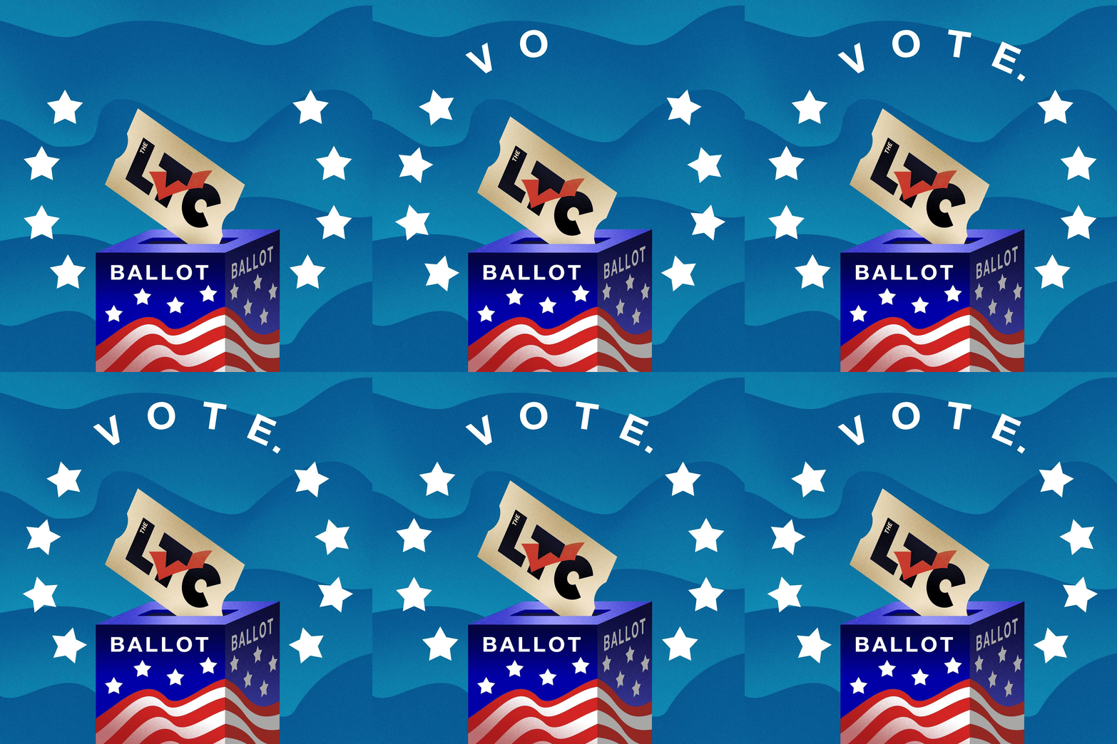
Special graphic made to encourage company members to vote in the 2020 Election

Announcement of the LTC's 2020-2021 Executive Board

Open Pit Audition announcement for Mamma Mia!

Post advertising our first build of the season! These are set building sessions where we try to get as many behind the stage people to come help out!

Promotional post for a Musical Score analysis workshop based on Sondheim

Promotional post for a coffeehouse performance held by the cast of Sweeney Todd

Audition advert for She Loves Me

Open Dance Call announcement for Mamma Mia!

Promotional Teaser leading up to the announcement of our 22nd Season
LTC Website
As Web Developer, I maintained the website for the company during the 2018-2019 Season and then revamped it when taking over as Artistic Director and instituting the new visual identity. I went through and updated a lot of the oldest sections of the 2011-made Squarespace site and made the language and resources relevant to the company today. I also made sure to go through and reinforce our brand and missions in the language, content, and organization of our website to reflect the goals of community-driven theatre and ethical process of the season.
The website has since been altered by the current board and Web Developer to suit their needs with the unusual circumstances of making theatre in the pandemic, but still exists as a navigable archived site at the link below:

The 20th Season
2017-2018
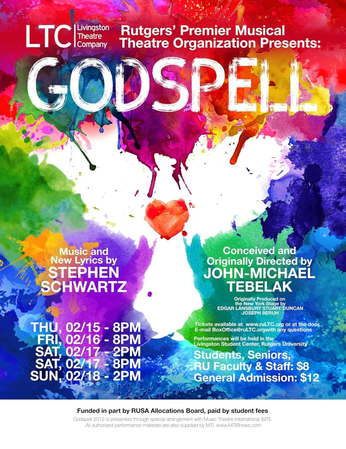
The LTC’s 2017-2018 Season marked it’s 20th ever and was made up of shows that had been produced by the company in years prior, reimagined by the current company members. These shows were Into the Woods, Godspell, and Legally Blonde. This was my first season designing for the company and I was fortunate enough to be granted the chance to direct the first show of the season as a first timer and a sophomore. Before even applying to direct, however, I was tasked with putting together a hype building campaign leading up to the 20th Season announcement and then the materials for the shows. I am immensely proud of my work while also appreciating how much I have grown since then and how much I have been able to use my early experience to refine the company’s visual identity later on.


